How I Make My Digital Prints
A quick breakdown of how I’m creating these digital prints to mark places, events, and milestones.
The idea was inspired by a visit to the Communication Museum in Berlin, where they had this display of , which were used for advertising purposes, and during the time of socialism, they also served as political slogans.
I liked how much meaning they could hold in such a small format, but I also loved the worn, imperfect look of the prints. It made me want to create my own version.
To make them, I’m using my iPad mini and the Procreate app. I usually start by sketching a few ideas for the graphic itself. Sometimes that might be a symbol of the city, for events something that reminds me of it, and others are more personal, like the cowboy hat tattoo I got while I was in Vegas with friends!
Once I have an idea for the graphic, I roughly place the date and city name and start trying out different layouts until I get something that feels balanced. For bigger milestones, like when I moved to Berlin in late 2025, I like to add my signature to make them feel a little more official.
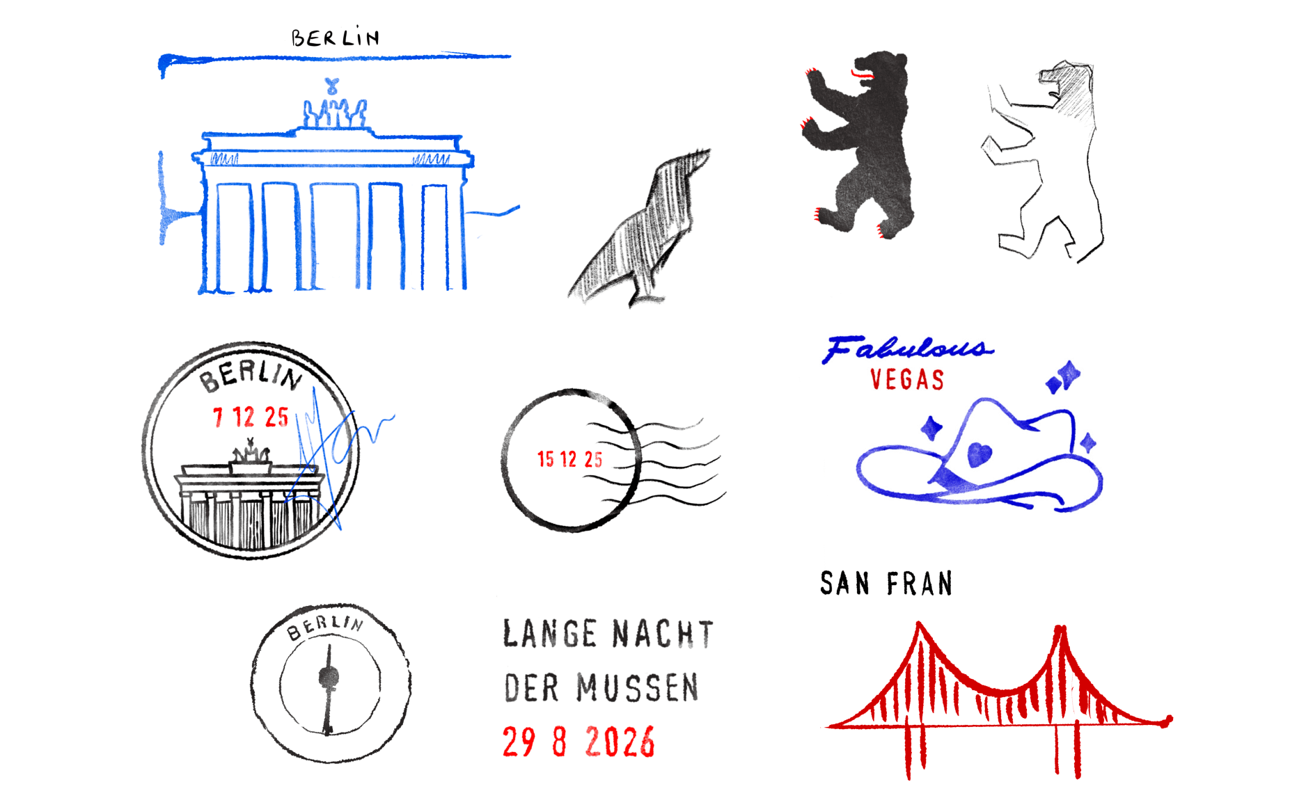
I use a lot of layers in Procreate when I do the initial sketching. Keeping everything separate means I can freely move things around and try different layouts until I land on one I like.
The brushes
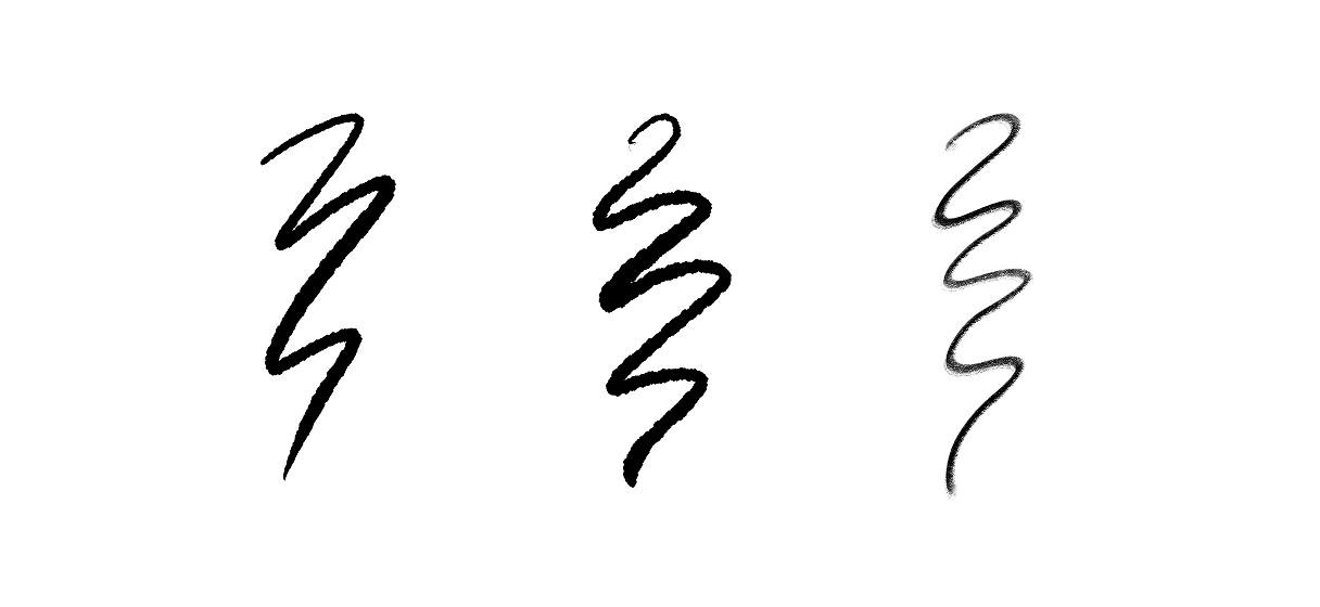
I mainly use this ink bleed brush that I found online. I also duplicated the original one and created a second brush after adjusting the jitter slightly. This gave me a version I could use wherever I wanted the ink to look more distressed.
Pressure is key to get that extra bleeding effect. In some areas, I draw slowly and pay close attention to how hard I’m pressing. This creates the feeling of too much ink seeping into the paper, which is how I drew the vertical suspension cables of the Golden Gate Bridge.
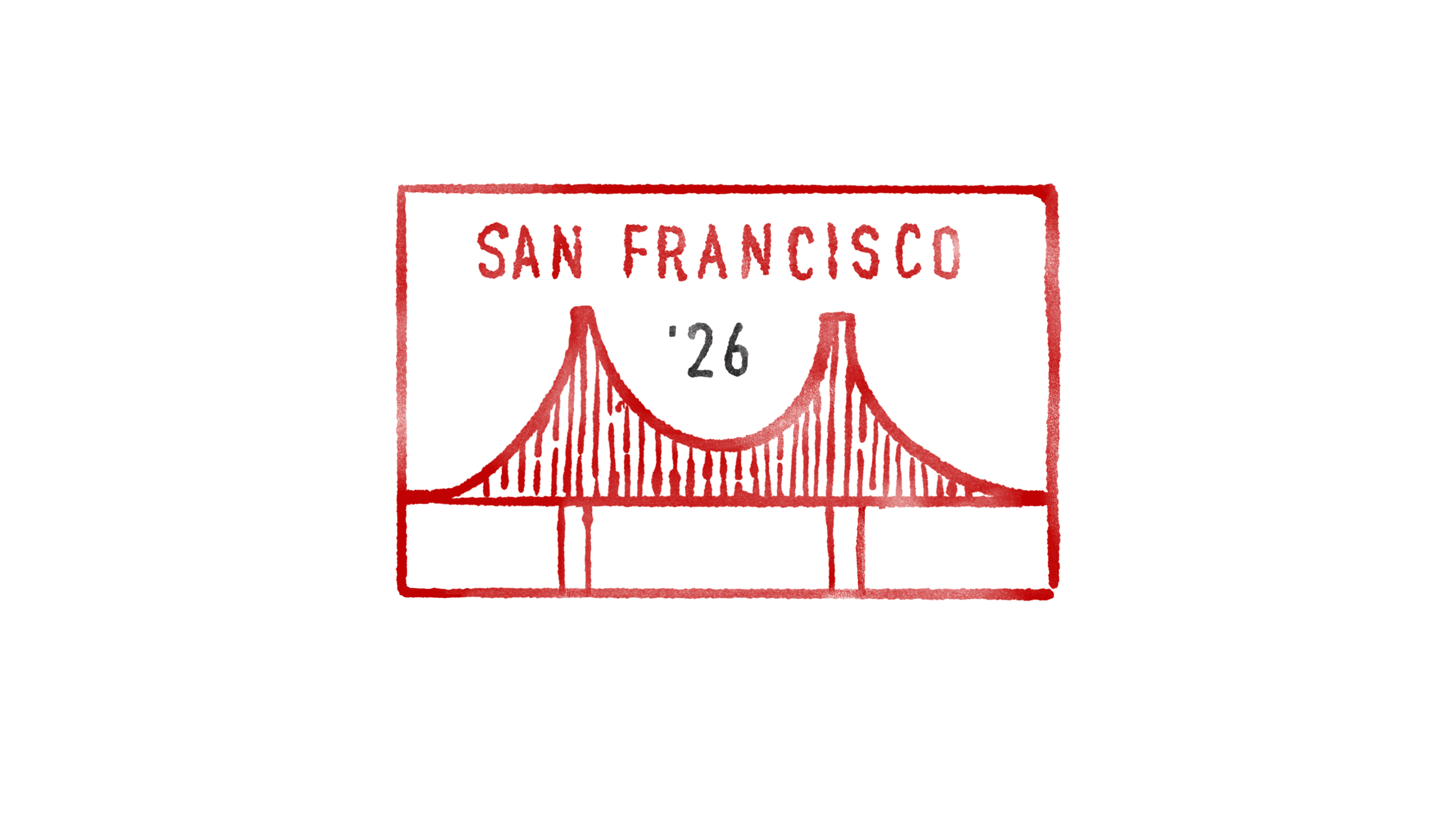
I don’t want every part of the drawing to bleed in the same way. Sometimes I deliberately add more distress and mistakes. I might roughen up a corner or erase parts of the ink to make it look like the stamp didn’t press evenly against the paper.
Typography
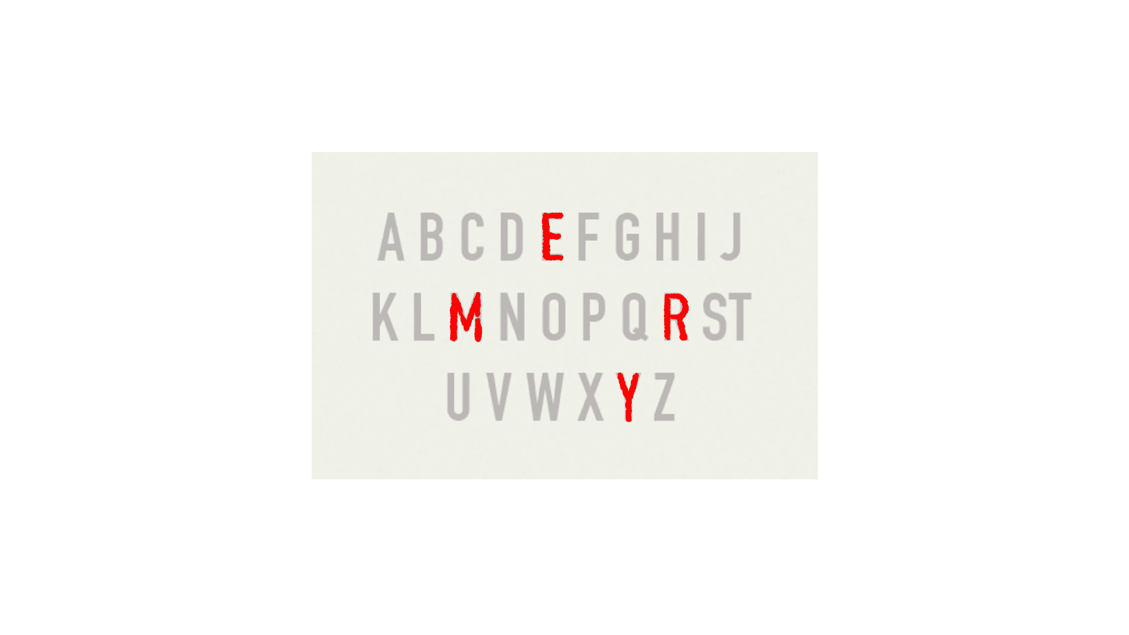
I can’t write perfectly aligned characters, so I’m using a basic sans-serif font template and trace over it. The template gives me structure and alignment, but I deliberately avoid following it too closely. Some strokes I keep thinner while others I spill outside the edges. This keeps the typography closer to the imperfect feel of a real rubber stamp.
Fading it
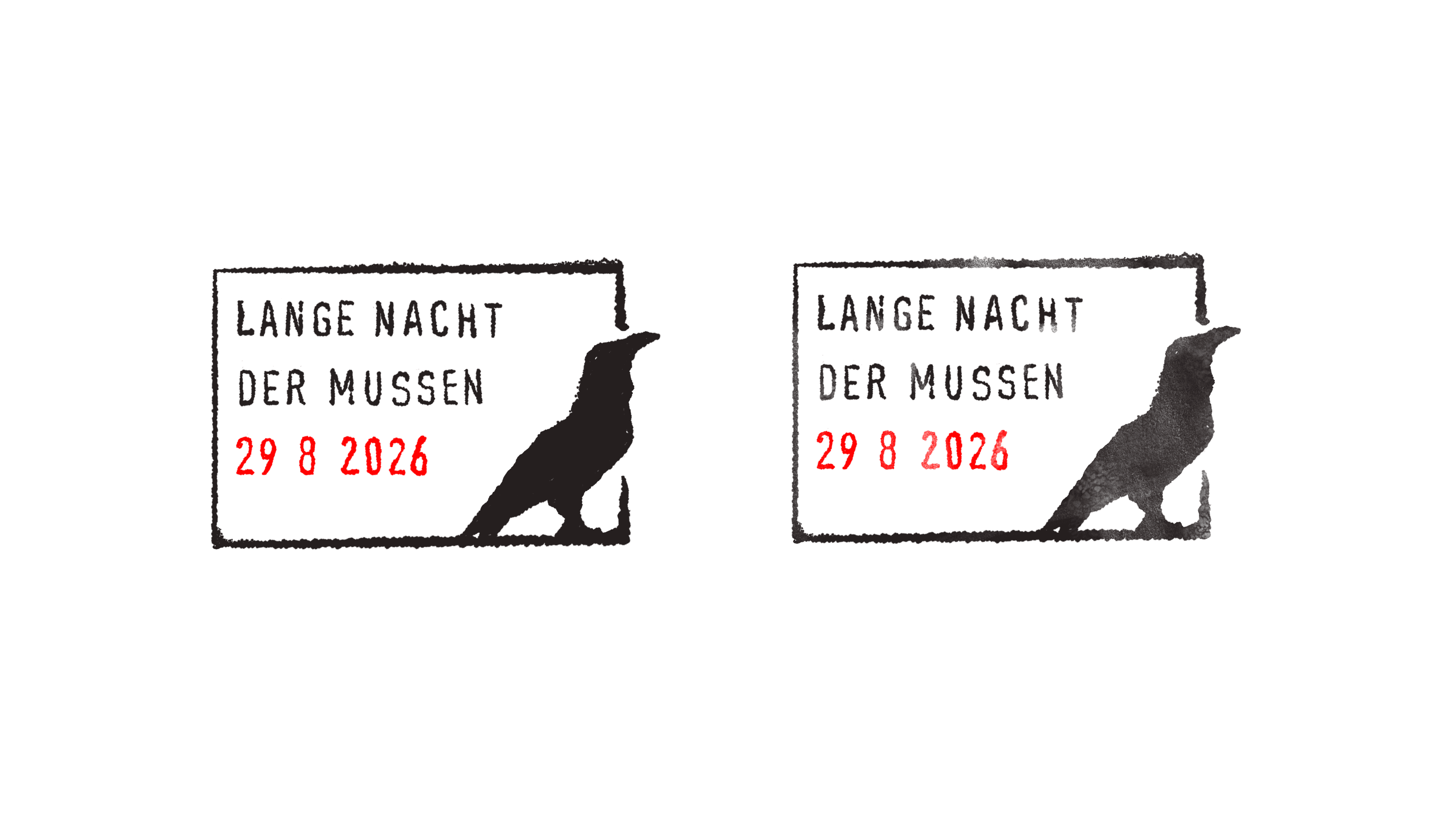
At this point, the print looked good and had the bleeding-ink effect I wanted, but something was missing. The contrast felt too perfect, it looked too new.
So I took an eraser, selected Procreate’s default Molesworth brush, lowered its opacity, and lightly passed over parts of the drawing.
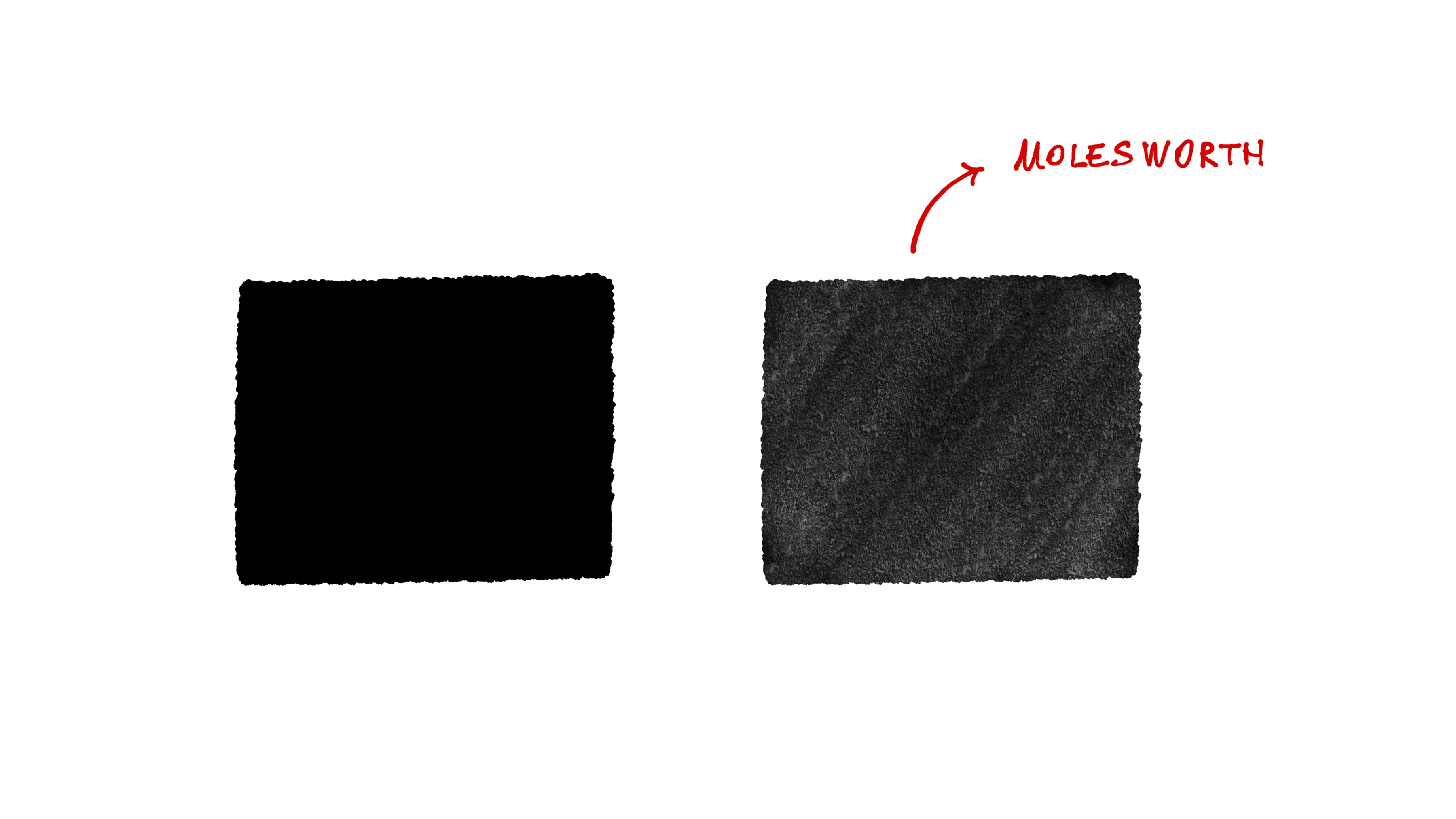
I run it over in some areas, especially where there’s a larger surface of “ink”. It immediately softened the contrast and took away the overly vibrant look of a digital stroke made from pixels.
A few other things that helped
- I use a Paperlike screen protector. It gives the pencil more grip and feels closer to drawing on real paper.
- I use the original Apple Pencil, but its standard tip feels too bulky when I’m drawing small details. I bought a cheap pack of thinner, pen-like tips from Amazon, and they make a huge difference when I’m working on the tiny details.
And that's all. Ty bye!